
Aera
Website redesign
Ecommerce Website Redesign
A refreshed digital experience designed to elevate the brand, simplify fragrance discovery, and make smart home fragrance more accessible.
Services
UX Strategy · UX/UI Design · Ecommerce Optimization · Design System · Conversion Rate Optimization
01 — The Challenge
Reimagining the fragrance shopping experience
Aera was ready for a digital refresh that better communicated its brand, showcased its technology, and created a more intuitive shopping experience.
Customers struggled to find fragrances they loved and understand what differentiated Aera's diffusers from traditional fragrance products. The site also lacked a cohesive brand narrative and clear product education to communicate the value of its offerings.
Initial quantitative analysis revealed another opportunity: shoppers were gravitating toward lower-priced diffuser options without fully considering the benefits of the full-size product.
02 — Research & Insights
Understanding the path to purchase
We used quantitative data analysis and qualitative research to identify friction points throughout the shopping journey.
Our findings revealed opportunities to better communicate product value, improve fragrance discovery, and simplify purchasing decisions.
A closer look at customer behavior validated that pricing played a significant role in diffuser selection, highlighting the need to better communicate the features and benefits of Aera's full-size diffuser.

03 — Optimizing the Experience
Removing friction, building momentum
Before the full redesign, we introduced targeted optimizations to address key usability challenges and improve the purchasing journey.
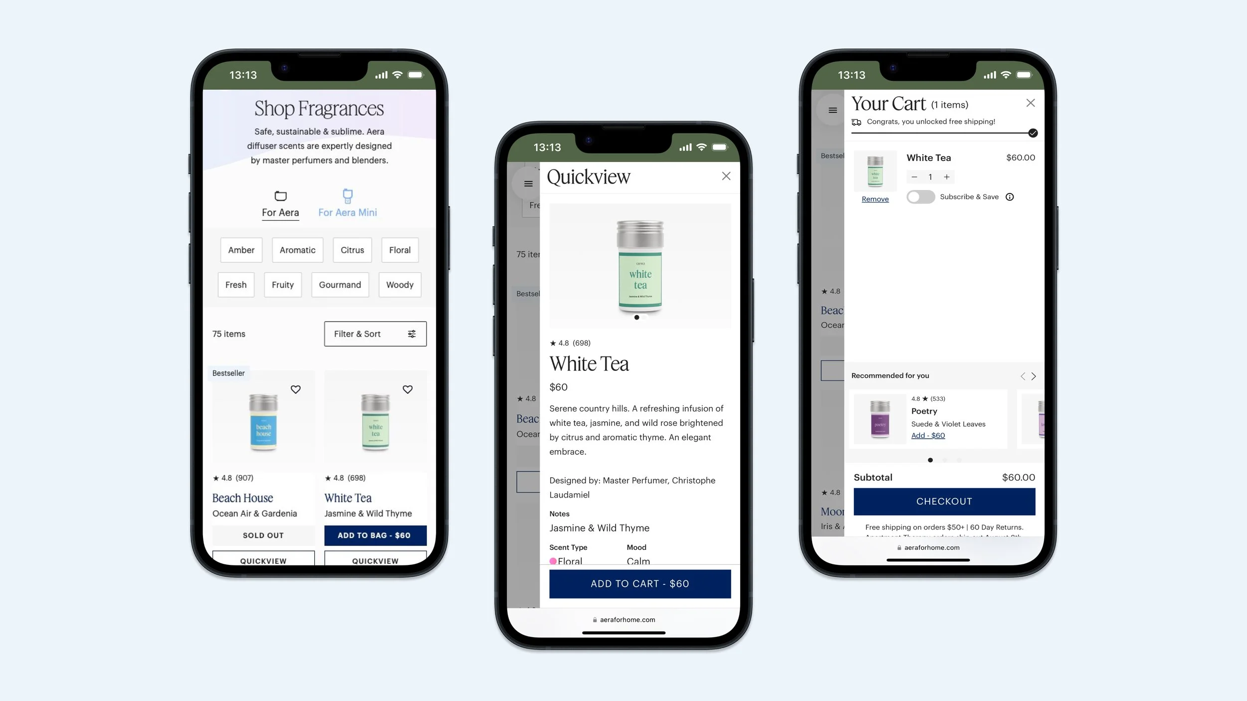
We redesigned the cart experience to make subscription and one-time purchase options easier to understand and select. We also removed an interaction that was directing customers toward lower-priced diffuser options before they had an opportunity to understand the full-size product's value.
These early improvements helped establish a stronger foundation for the larger redesign.
04 — Visual Direction
A more distinctive digital presence
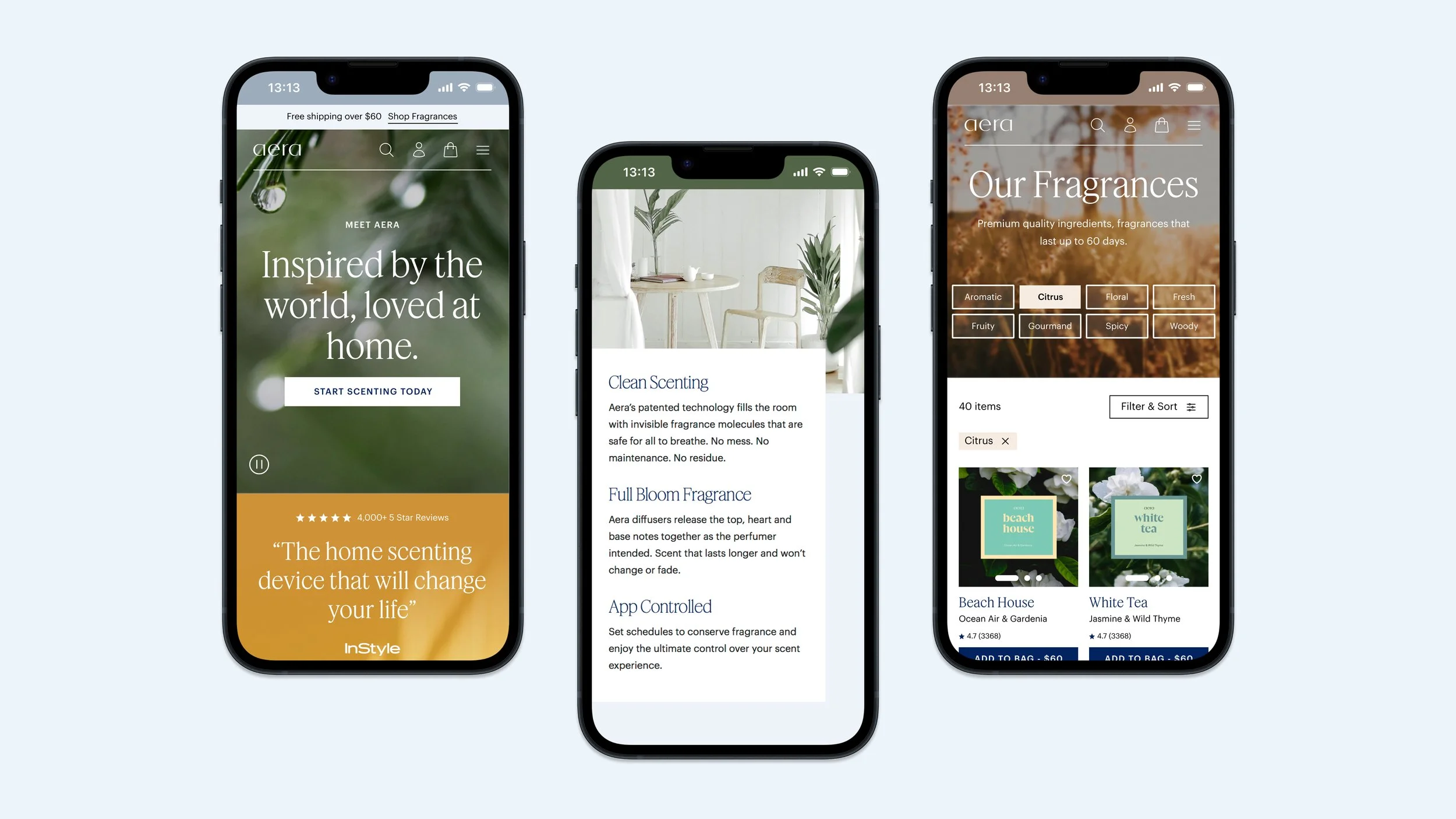
The redesign introduced a refreshed visual language that better reflected Aera's brand and positioned its products as a considered part of the home environment.
A stronger visual hierarchy, more intentional use of imagery, and clearer messaging created a cohesive experience across the site. Product features and technology were brought forward, giving customers a better understanding of what makes Aera different.
05 — Product Education
Communicating the value of better fragrance
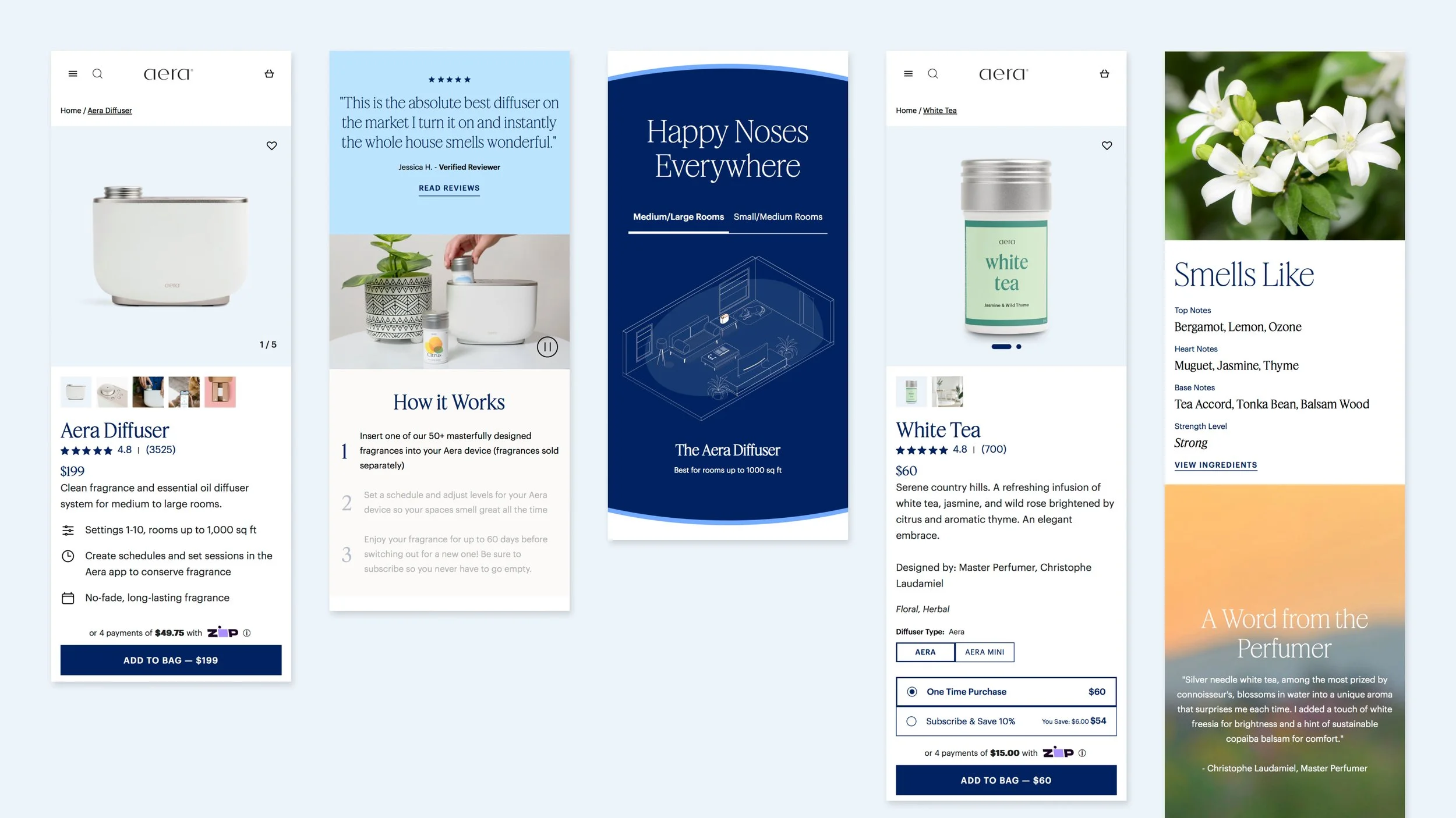
Aera's diffusers offer more than fragrance alone. We brought product functionality and key differentiators into the first viewport, making it easier for customers to understand the technology and benefits without having to search through lengthy product descriptions.
The redesigned product experience placed greater emphasis on product features, helping customers make more informed decisions and better understand the value of each diffuser.
06 — Fragrance Discovery
Finding a fragrance that feels personal
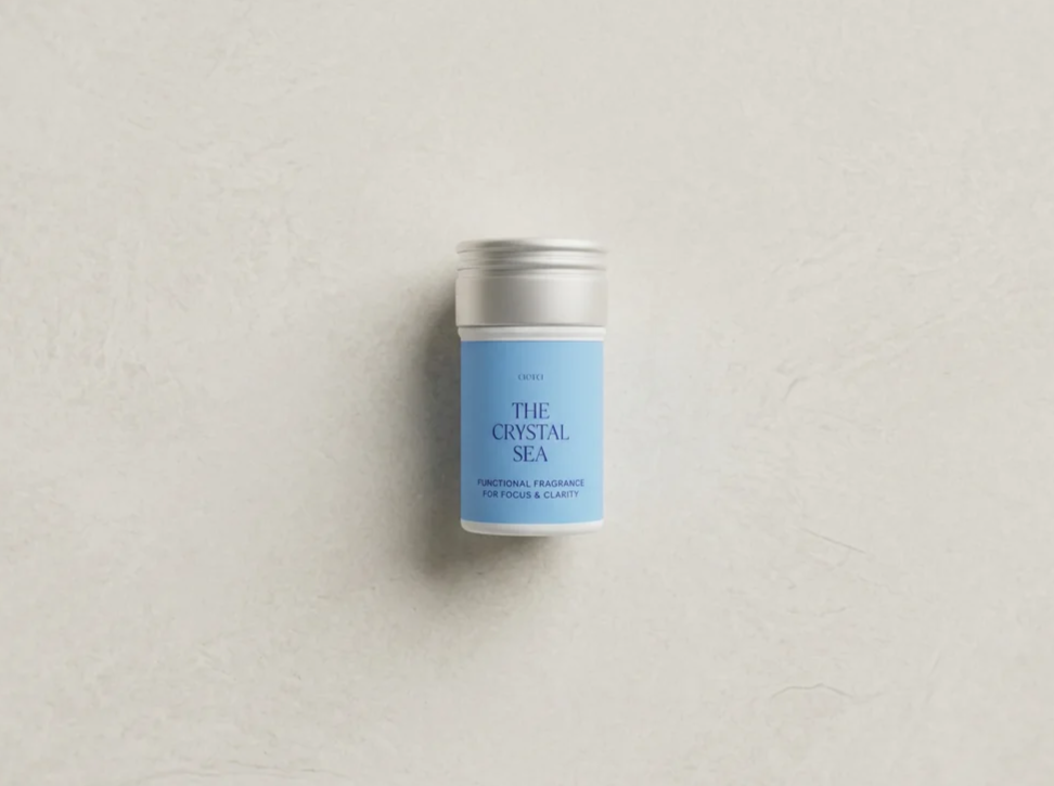
With fragrance playing such an important role in the purchase decision, we reimagined how customers explore and discover scents.
Prominent scent filters on collection pages made it easier to narrow selections based on individual preferences. Product detail pages introduced more descriptive scent profiles, social proof, and ingredient imagery to help customers understand what each fragrance offers before purchasing.
A new quick view experience also allowed shoppers to explore fragrance and diffuser details without leaving the collection page.
07
A Simplified Shopping Journey
From discovery to checkout
Across the redesigned experience, we focused on creating a more intuitive path from product exploration to purchase.
Clearer product information, streamlined interactions, and improved cart functionality helped customers move through the shopping journey with greater confidence. Each touchpoint was designed to feel connected, reducing unnecessary friction and making the experience easier to navigate.
08
Built for Continued Growth
A flexible foundation for what's next
The redesigned website was built around reusable components and a well-defined design system, creating a consistent experience while giving the brand the flexibility to evolve.
This foundation supports ongoing optimization, allowing new features, content, and merchandising experiences to be introduced without compromising the overall design.
09
The Results
A clearer path to conversion
The redesigned experience improved engagement and helped more customers progress through the purchasing journey.
Following the launch of site improvements, we saw increases in add-to-cart activity and checkout initiation, alongside higher engagement with key website elements.
More customers moving from discovery to checkout.
A more intuitive shopping experience, clearer product education, and improved fragrance discovery created a stronger foundation for continued ecommerce growth and optimization.